TRBET
TrBet Website Redesign

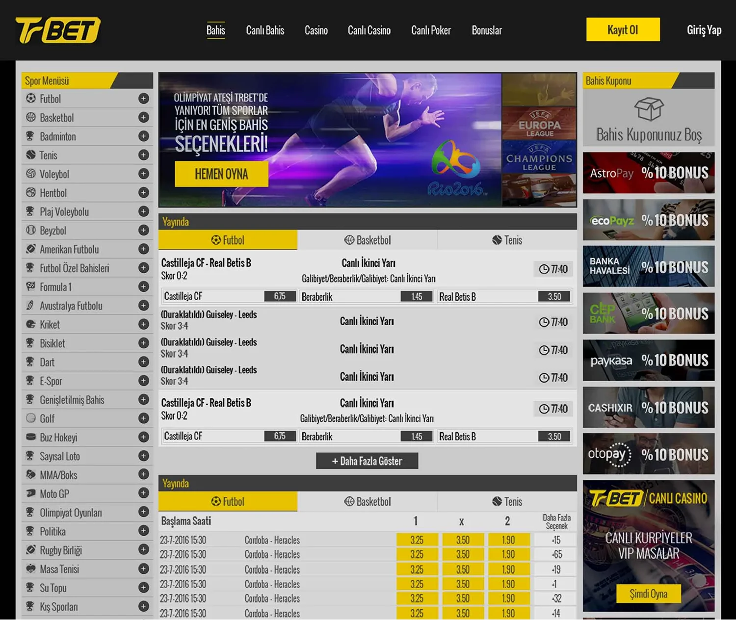
The problem
The old design looked outdated and cluttered, with too many elements competing for attention. Finding odds or matches quickly was difficult, the color contrast hurt readability and the layout didn’t adapt well to smaller screens. Overall, it didn’t feel reliable or user-friendly, what was an issue for a website that handles money.
Why does responsive design matter?
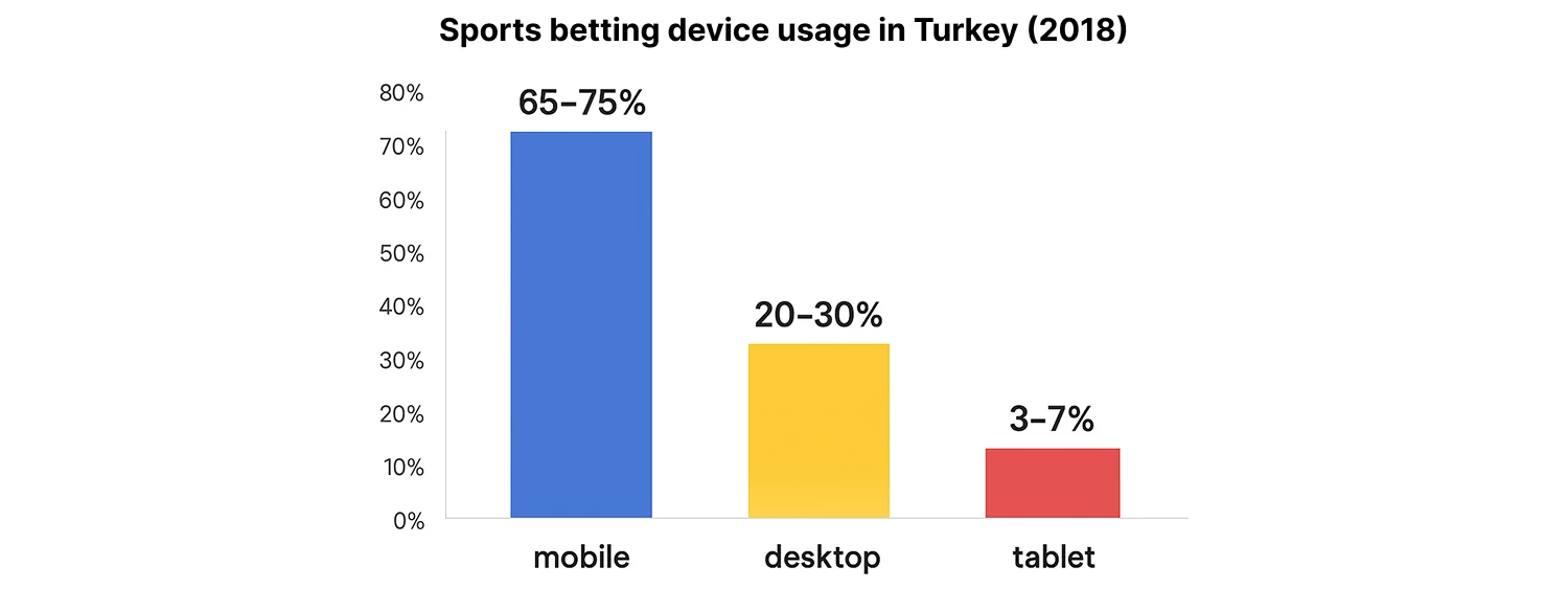
Most players in Turkey access betting sites from their phones. On the old TrBet site, players had to constantly pinch, zoom and scroll just to see the basics. This friction made the experience frustrating and unreliable, directly impacting player trust and engagement.
Design process
Competitor research
I analysed leading Turkish betting websites (İddaa, Bilyoner, Nesine, Misli, Tuttur) to study how they presented odds, structured navigation and highlighted key actions. This helped identify industry standards and opportunities for TrBet to stand out.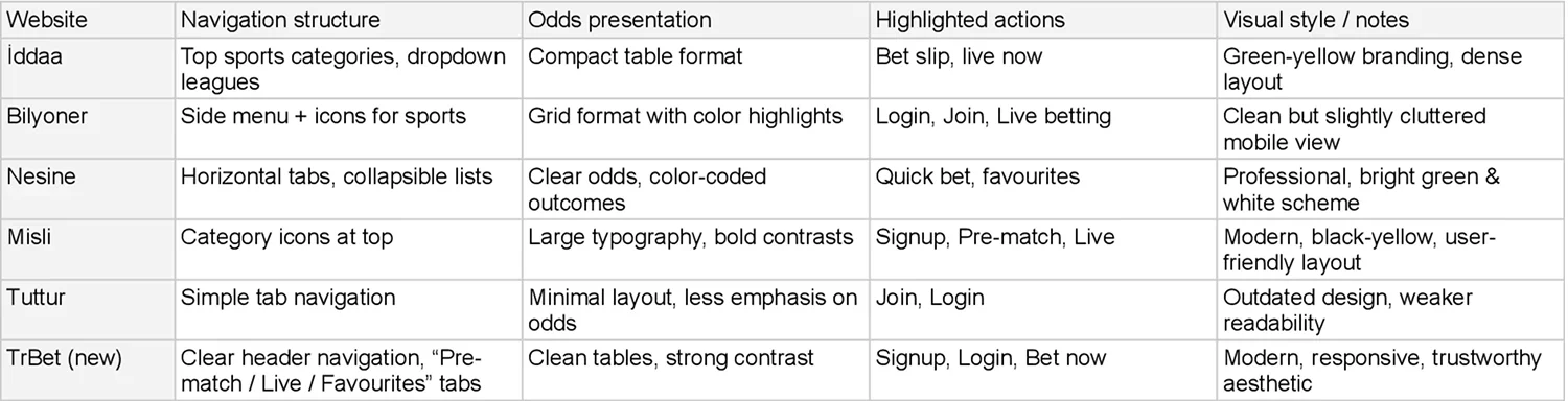
Moodboards & inspiration
TI gathered visual references for color palettes, typography, layouts and icons to define a modern and trustworthy style.
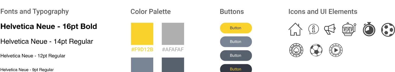
Style guide & design system.
I created a design system with:
- Consistent colors and legible typography
- Reusable components (buttons, cards, forms, navigation)
- Scalable icons for clarity across all devices
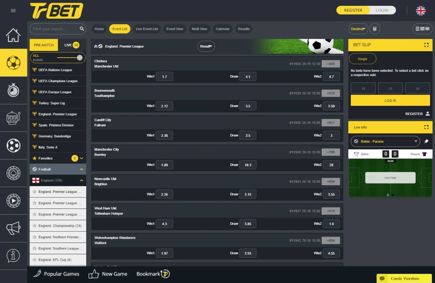
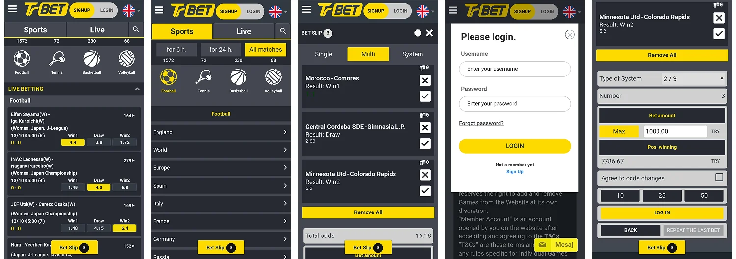
High-fidelity UI design
Using wireframes from the UX designer, I developed high-fidelity screens for homepage, event details, bet slip and account pages—focusing on readability, balance and smooth scaling across desktop and mobile.
Interactive prototype
I built clickable prototypes in InVision to demonstrate responsive behavior and realistic user interactions across devices.
User testing – Part 1
We tested a prototype with players to evaluate navigation and usability.
Outcome:
- Difficulty finding popular leagues (Süper Lig, European championships).
- The language switch in the footer was hard to locate.
- On mobile, players wanted larger menu buttons with clear icons.
- Struggled to find Live sports games.
- Players wanted a quicker way to access their favourite teams and leagues.
User testing – Part 2
The improved prototype addressed the earlier issues.
Outcome:
- Players quickly found top leagues, Live games and their Favourites.
- Larger mobile buttons made tapping easier and navigation smoother.
- Moving the language switch to the header removed confusion.
- Overall feedback: the design felt intuitive and trustworthy.
Final design
- Leagues first: Süper Lig and Champions League placed at the top of the sports menu.
- Visible language switch: moved to the header for constant accessibility.
- Mobile navigation: redesigned with bigger buttons and clear icons.
- Quick access: dedicated “Pre-match,” “Live” and “Favourites” tabs added at the top.
Final outcome:
The redesign transformed TrBet into a reliable, user-friendly betting platform:
- Players could place bets faster and access matches without friction.
- Mobile players enjoyed a smooth, responsive experience.
- The clean, professional interface built credibility and trust.
TrBet moved from a cluttered, outdated look to a modern platform that aligned with user expectations and industry standards.