STUDIO ONE
Studio One corporate
website concept

Role (Freelance)
UI/UX DesignerDuration
2 monthsYear
2025Overview
After working together on a redesign ( see the work ) of his personal portfolio website vladimir-fasij.com, Vladimir Fasij decided to stop freelancing and launch a studio with a team to handle growing demand. The original portfolio redesign was never developed, because the focus shifted from an individual brand to a studio brand.
Studio One is his new 3D architectural visualisation studio. I was asked to create a new corporate website concept that reflects a premium, minimalist identity and clearly presents services, projects and expertise. The goal was to design a calm, structured site where the renders lead and the layout stays unobtrusive.
The problem
The earlier portfolio design and existing online presence no longer matched the new direction. They were built around a personal brand and felt too decorative and busy for a studio that wanted a more corporate, minimalist feel.
There were too many visual effects, mixed typography studios and competing colours. This distracted from the renders and did not align with the calm, premium aesthetic that Studio One wanted to project. At the same time, the structure did not clearly separate services, projects and studio information, making it harder for potential clients to quickly understand what the studio does and who it works with.
Team & collaboration
I worked as the UI/UX designer on this project, collaborating directly with Vladimir as the founder and creative lead. He defined the business goals, target audience and positioning for Studio One and shared the written brief, service list and portfolio examples. My responsibility was to turn this into a clear site structure, visual concept and page designs that could later be implemented in Webflow.
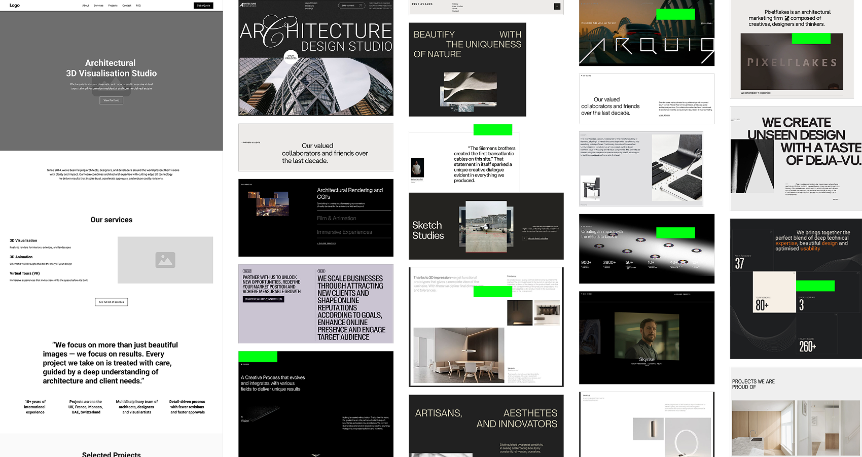
Competitive analysis
I reviewed websites of leading 3D visualisation and design studios, including PixelFlakes and other minimalist, premium studios. Most of them used large imagery, one clean sans-serif font, neutral colour palettes and plenty of white space. The layout felt almost invisible and the renders were always the main focus.
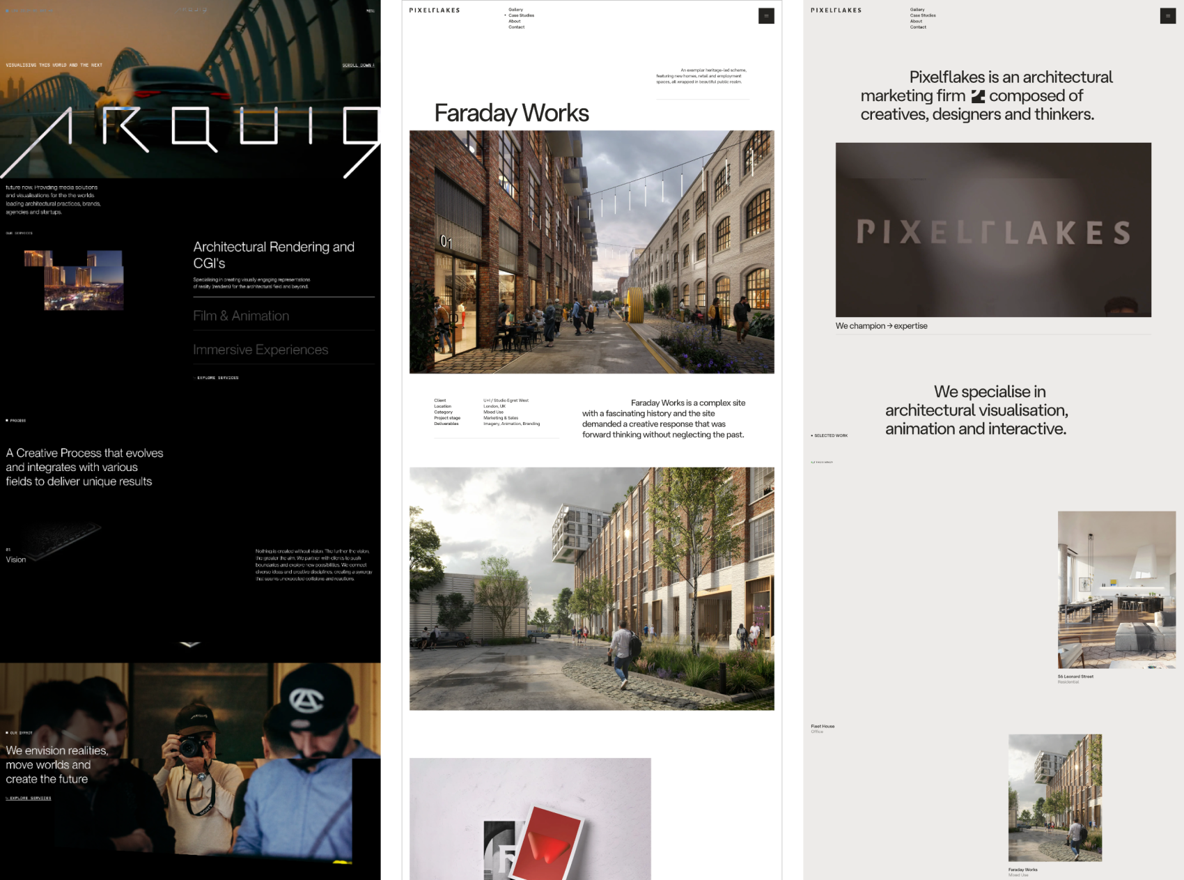
Comparing this to our starting point made it clear that we needed to remove decoration, reduce visual noise and move toward a quieter, typography-led design where structure and spacing do most of the work.
How I identified the problems
I began by reviewing the earlier portfolio design and the content Vladimir wanted to carry into the new studio site: services, project types, client profiles and studio story. I mapped how this content would need to be restructured for a studio rather than an individual.
We then went through the brief together and clarified three things:
- who Studio One wants to attract (architects, developers, interior designers and investors)
- which services are most important to highlight
- what kind of first impression the studio wants to create
From this work we identified the main issues:
- the previous visual language felt too expressive and personal, not calm and corporate
- project renders were strong but surrounded by visual noise
- services were not structured in a way that supports quick understanding and comparison
- calls-to-action were not clearly placed or consistent
- the overall studio did not match the desired minimalist, PixelFlakes-inspired aesthetic
These findings guided the structure and visual direction of the new concept.
Defining the visual concept
Based on the brief, I listed emotions and associations that should be tied to Studio One: photorealism, elegance, luxury, harmony, calmness, space, light and shadow and premium materials. From this list I selected three core directions: elegance, photorealism and calmness, with elegance as the primary focus.
I created a moodboard using references from portfolio sites, Pinterest and Behance that reflected these qualities: minimal layouts, simple typography, soft contrast and strong imagery. This established a visual language where design supports the work instead of competing with it.
From there, I defined a few core visual principles:
- a grid-based layout with generous white space to express calmness and control
- one modern sans-serif font with weight and size for hierarchy, instead of multiple font families
- a neutral palette (white, black, light grey) with very subtle accents so the renders stay dominant
- quiet headings and short, focused copy blocks to support an elegant tone
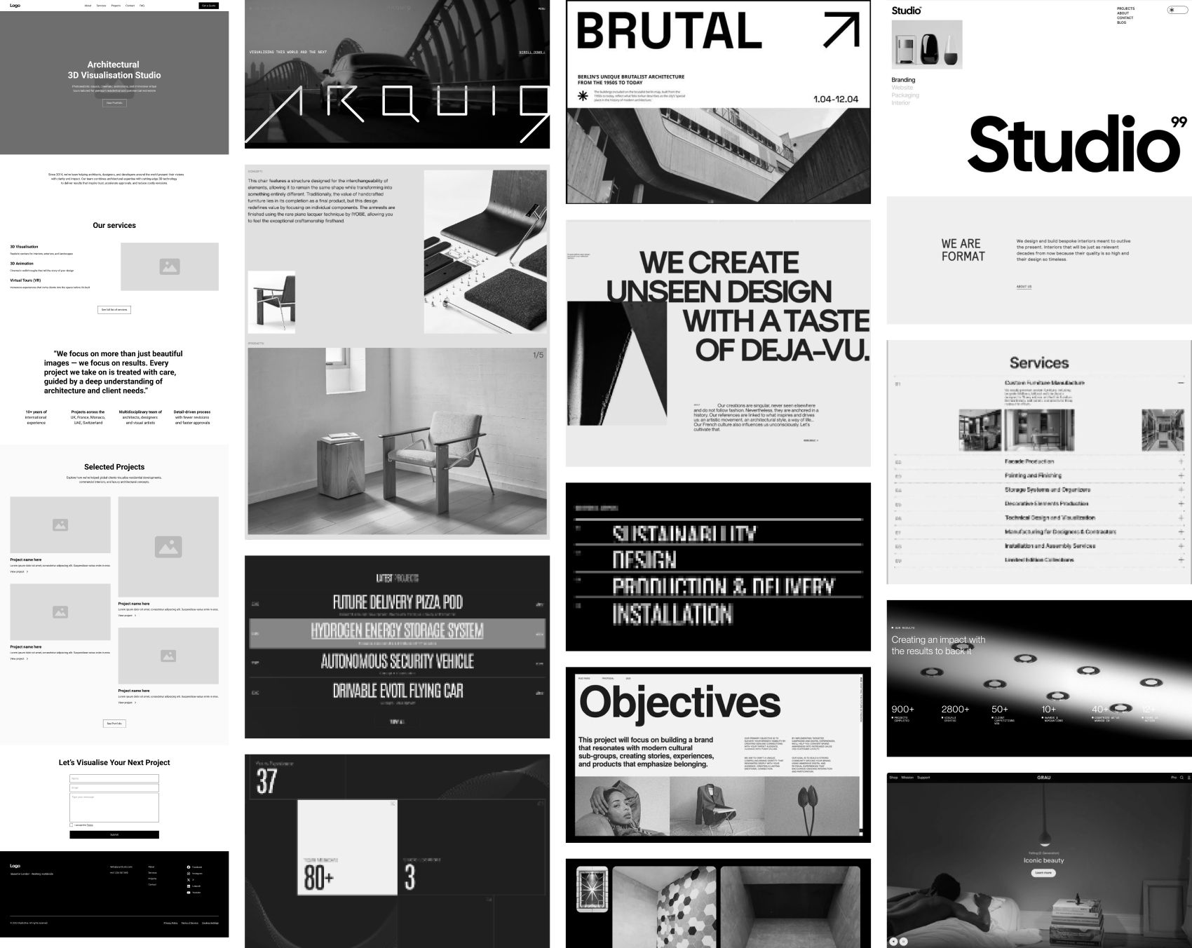
I then collected composition references for each key section (hero, services, projects, about, contact), combined the strongest ideas into full-page “frankenstein” layouts and refined these into the final visual concept for Studio One.
Design decisions
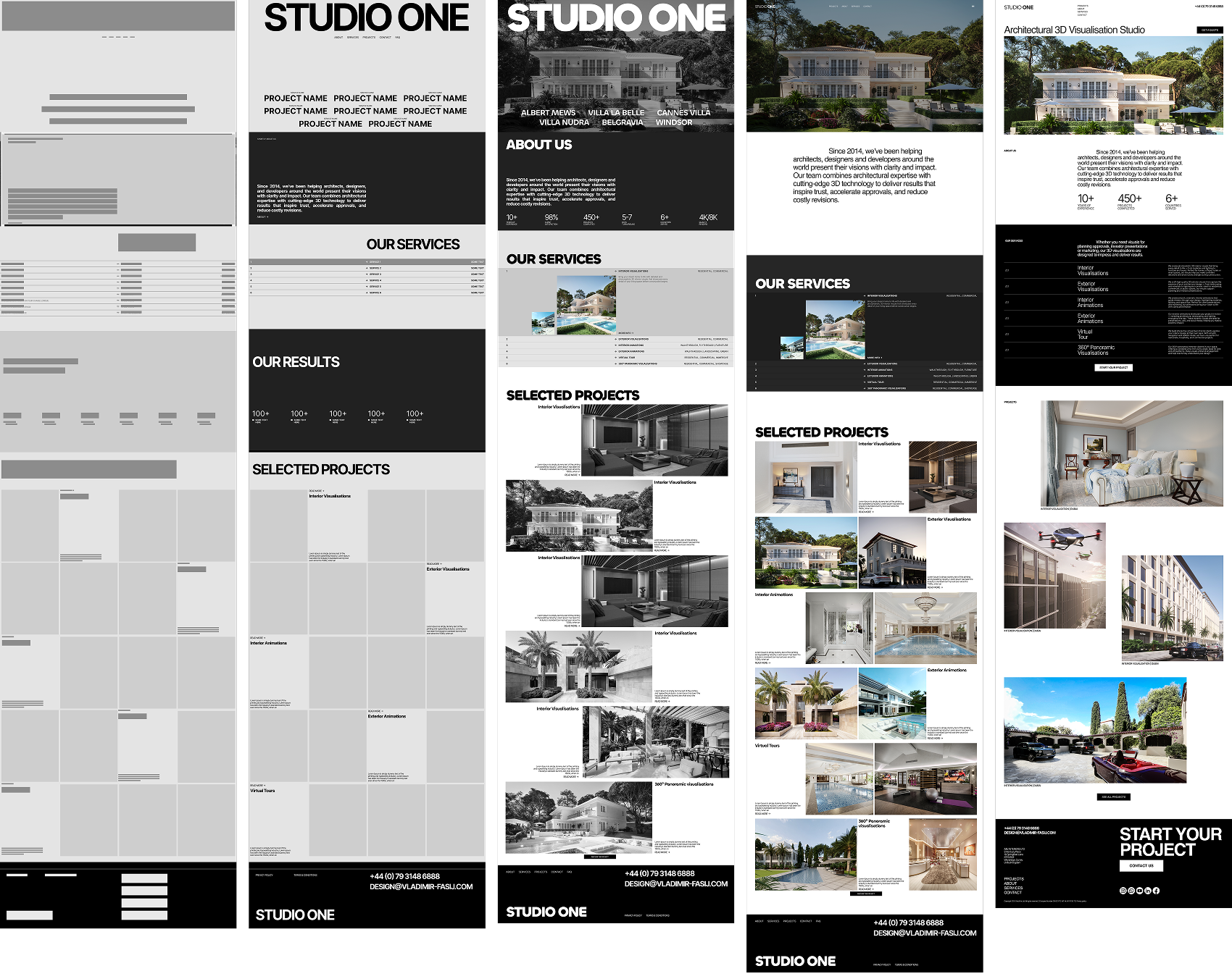
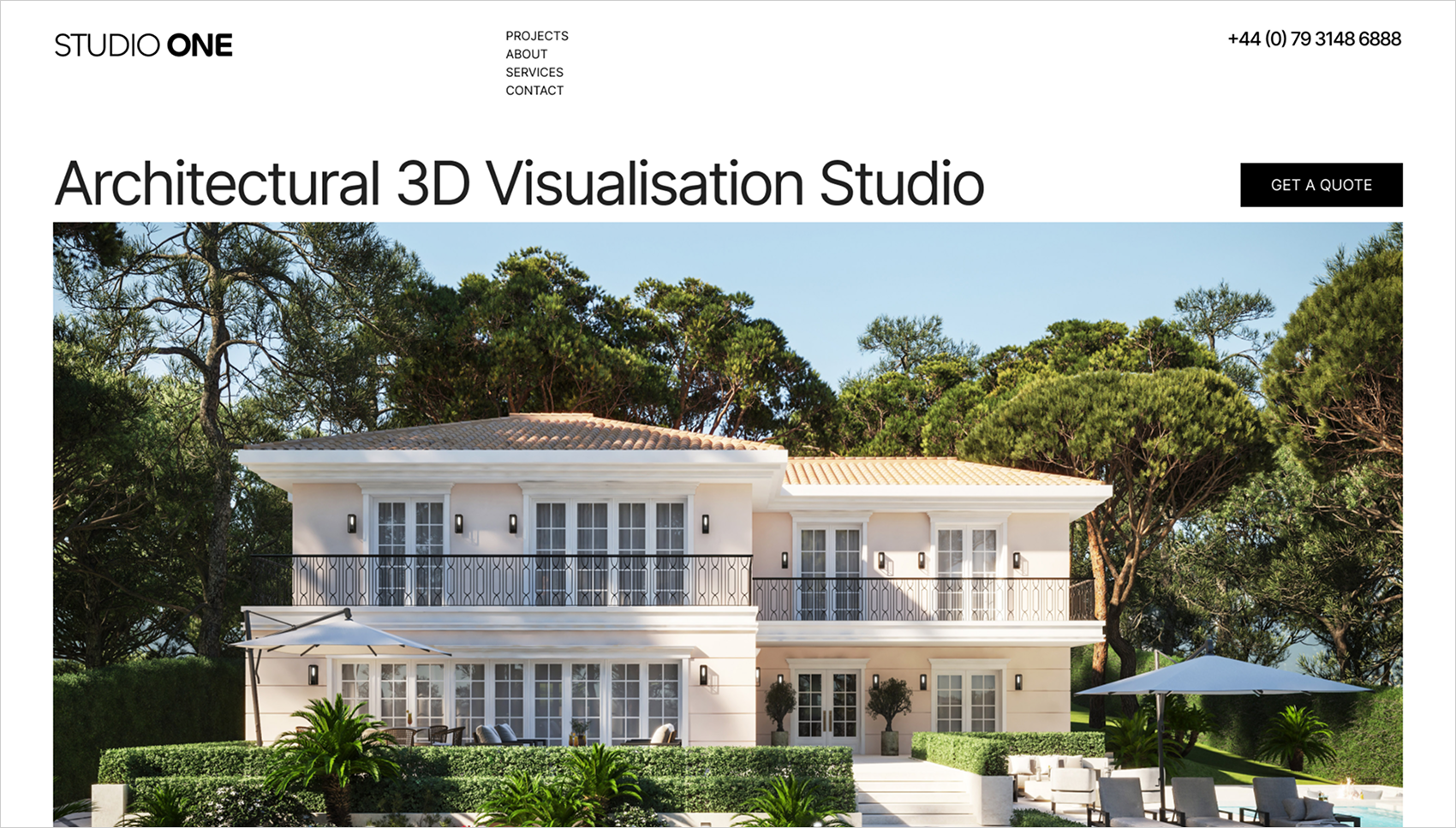
1. A hero that leads with the work
The hero section uses a large highlight render with minimal text and a simple, confident heading. This immediately communicates Studio One’s focus on architectural 3D visualisation and sets a calm, premium tone from the first screen.
2. A modular, grid-based homepage
The homepage is built on a three-column grid with a clear vertical rhythm. Sections such as services, who we work with, selected projects and why choose Studio One are separated into calm, modular blocks. This makes the page easy to scan while keeping enough white space so nothing feels crowded.
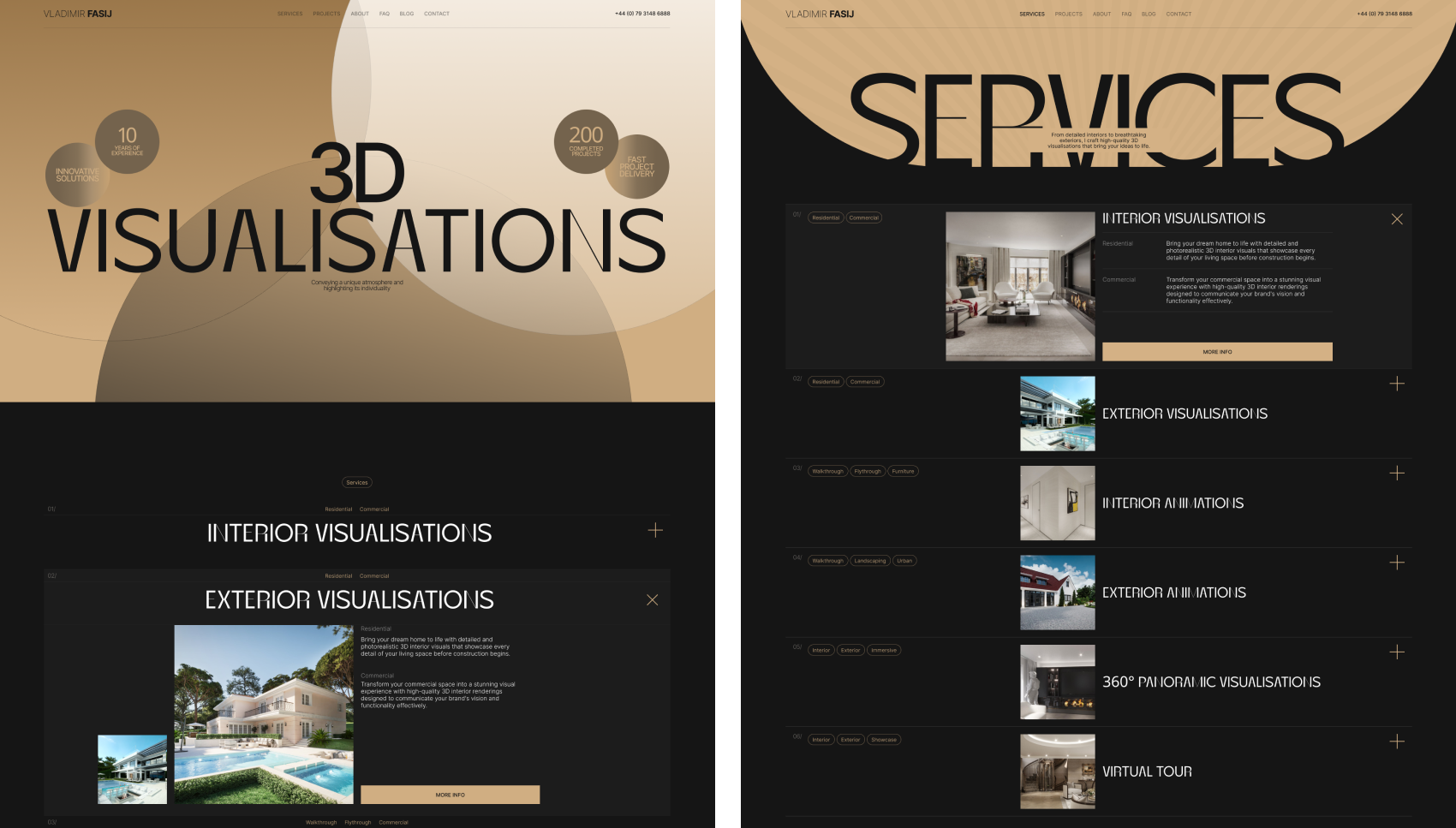
3. Service pages structured for decision-making
Each service page follows a consistent framework based on the brief: what we offer, perfect for, use cases, what you get, process overview, related work and a call-to-action. This helps visitors quickly understand whether the service matches their needs and what working with the studio looks like.
4. Project pages built around imagery
Project pages are designed to showcase visuals first. Each project includes a simple header, short overview, focused description, full-width visual gallery, a brief process summary and clear next steps (next project and contact). The layout lets the renders carry the story while providing enough context for potential clients.
5. A premium, minimalist visual language
The visual identity of the concept is based on one clean sans-serif font, a neutral colour palette and strong alignment. There are no gradients, decorative shapes or overlapping elements. Typography relies on weight and spacing instead of effects. This creates a calm environment where the renders are always the main focus.
6. Clear calls-to-action and contact paths
Calls-to-action are kept simple and placed where they are most useful: after selected projects, at the end of service explanations and in the contact and FAQ sections. The main actions are view work, explore services and contact the studio. This makes it easy for visitors to move from browsing to reaching out.
7. Responsive structure for all devices
The layout was designed to adapt cleanly across desktop, tablet and mobile. On smaller screens, the grid collapses into clear vertical sections with full-width visuals and simplified navigation. Typography and spacing scale down while preserving the sense of calm and structure.
Implementation & handoff
I first defined the page hierarchy and content structure in wireframes, then developed the high-fidelity designs based on the approved visual concept. The final design set includes layouts for all core pages: home, services, service details, projects, project details, about, contact and FAQ.
Along with the layouts, I documented basic layout rules, typography scale, spacing and image handling so the concept can be implemented in Webflow with consistent behaviour across breakpoints. At this stage the project sits as a completed design concept, ready for development when the studio decides to move forward.
The final designs
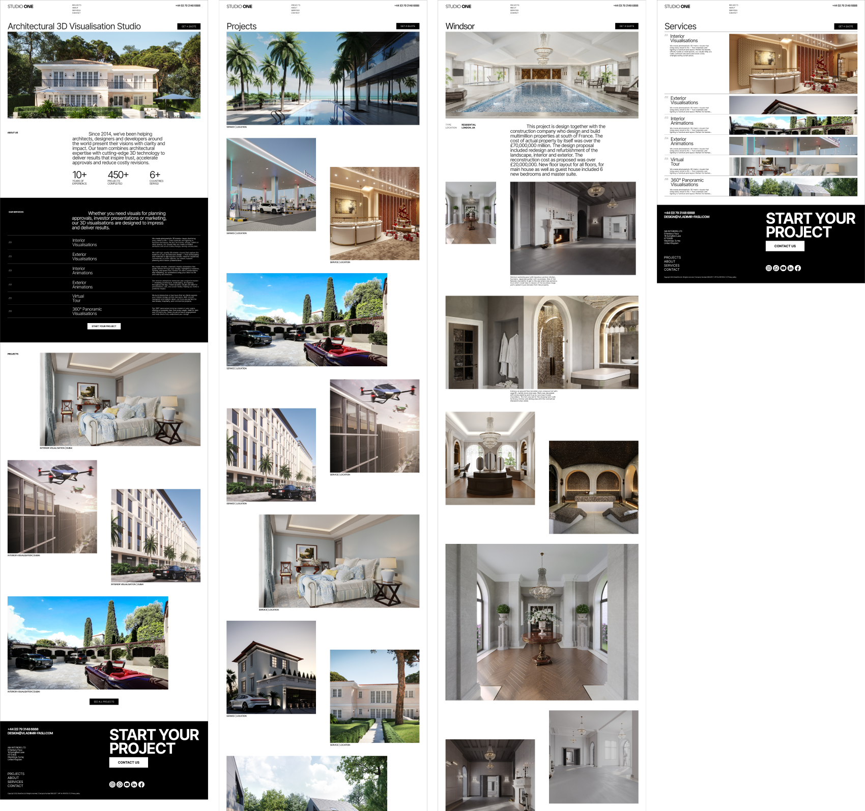
The final concept gives Studio One a calm, modern and structured corporate website direction. Large imagery, a minimalist grid and neutral typography make it easy for visitors to understand what the studio does, see the quality of its work and trust the brand. The layout stays in the background so the focus remains on photorealistic visuals and clear messaging.
Result
A clearer digital direction for the new studio brand.
A structured content model for services, projects and studio information.
A minimalist visual system that can be implemented in Webflow.
A concept that aligns with the desired elegant, photorealistic and calm positioning.
Summary
I took the learnings from an unbuilt personal portfolio redesign and used them to define a new, minimalist corporate website concept for Studio One. The result is a calm, structured design direction that aligns the studio’s digital presence with its real strengths: photorealism, elegance and premium presentation for architects, developers and designers.