NetBet
NetBet Sportsbook
Betslip Redesign
Overview
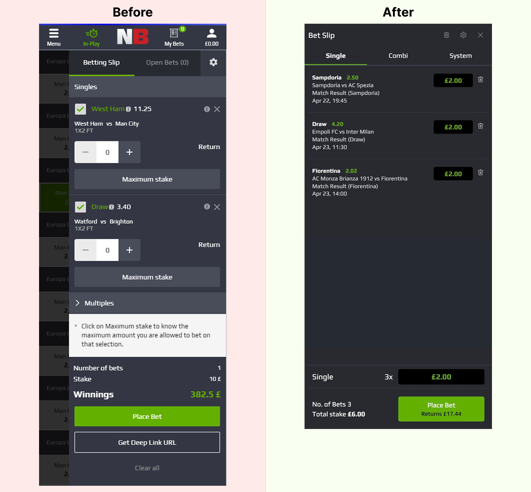
The old betslip was hard to scan, slow to use and easy to misunderstand. I redesigned it to make the layout clearer, the structure cleaner and the interactions more predictable.
The problem
The original betslip created friction at almost every step. Important information was buried in a heavy layout, interactions were not clearly guided and users had to work harder than necessary to place a simple bet.
Team & collaboration
I worked as a mid-level UI designer in a cross-functional team with a project manager, design manager, business analyst, front-end and back-end developers and QA. The product and UX teams had already defined the main bet flows, requirements and KPIs. Compliance shared regulatory rules and edge cases and data and QA highlighted common issues such as missed price changes and input errors. My role was to translate these inputs into a clear, scalable betslip UI and document it so developers could implement it consistently.
Competitive analysis
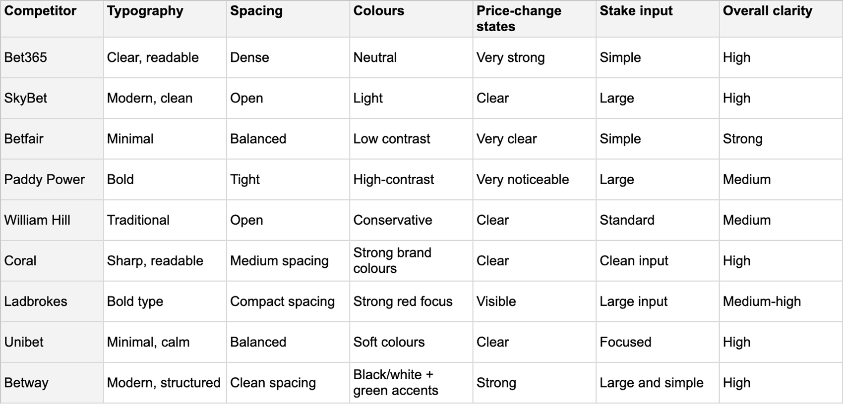
Competitors showed cleaner spacing, a stronger hierarchy and clearer state changes.
NetBet needed the same level of clarity without copying existing patterns.
How I identified the problems
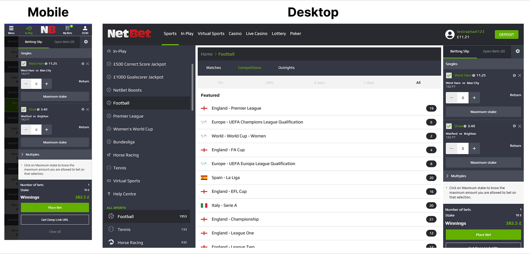
I reviewed the old betslip across mobile and desktop. I compared it against common betting UI patterns and the behaviour of major competitors. I also looked at feedback from product, QA and customer support and checked it against existing requirements and flows defined by the product team. This helped me understand where users struggled and where the structure caused confusion.
The main issues I identified were:
- the layout was visually overloaded and hard to scan
- the stake input field lacked clarity and was not intuitive for new bettors
- price changes and odds updates were easy to miss
- the UI did not clearly guide users through the bet
- overall, it took more effort than necessary to place a bet
These insights shaped every design decision in the redesign.
Design decisions
1. A cleaner, focused header

The original header had icons, labels and actions competing for attention. This made the top of the betslip feel heavy and unfocused. I reduced it to a clear title and essential actions to give users a simple starting point.
2. Clearer and more consistent tabs

All three bet types were grouped together in one area, which made it hard to see which mode was active. I removed the extra buttons and introduced clear tabs for single, combi and system. This improved alignment and spacing and made switching between bet types obvious.
3. A simplified and structured bet label
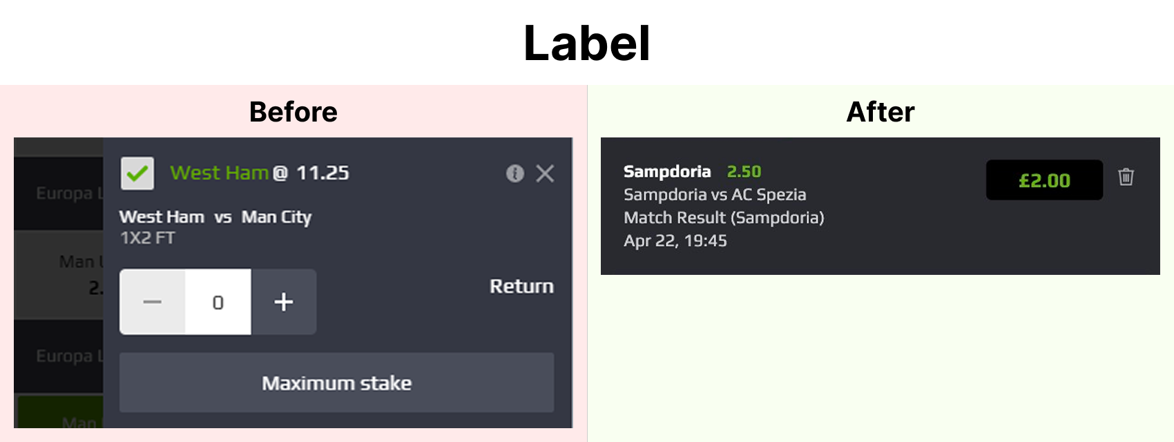
The old bet item mixed important information (selection, odds, event details and stake) with equal weight. This slowed down scanning and stake entry. I separated the information into clearer layers and improved the contrast between odds and stake to support quick interaction.
4. A more stable layout for multiple selections
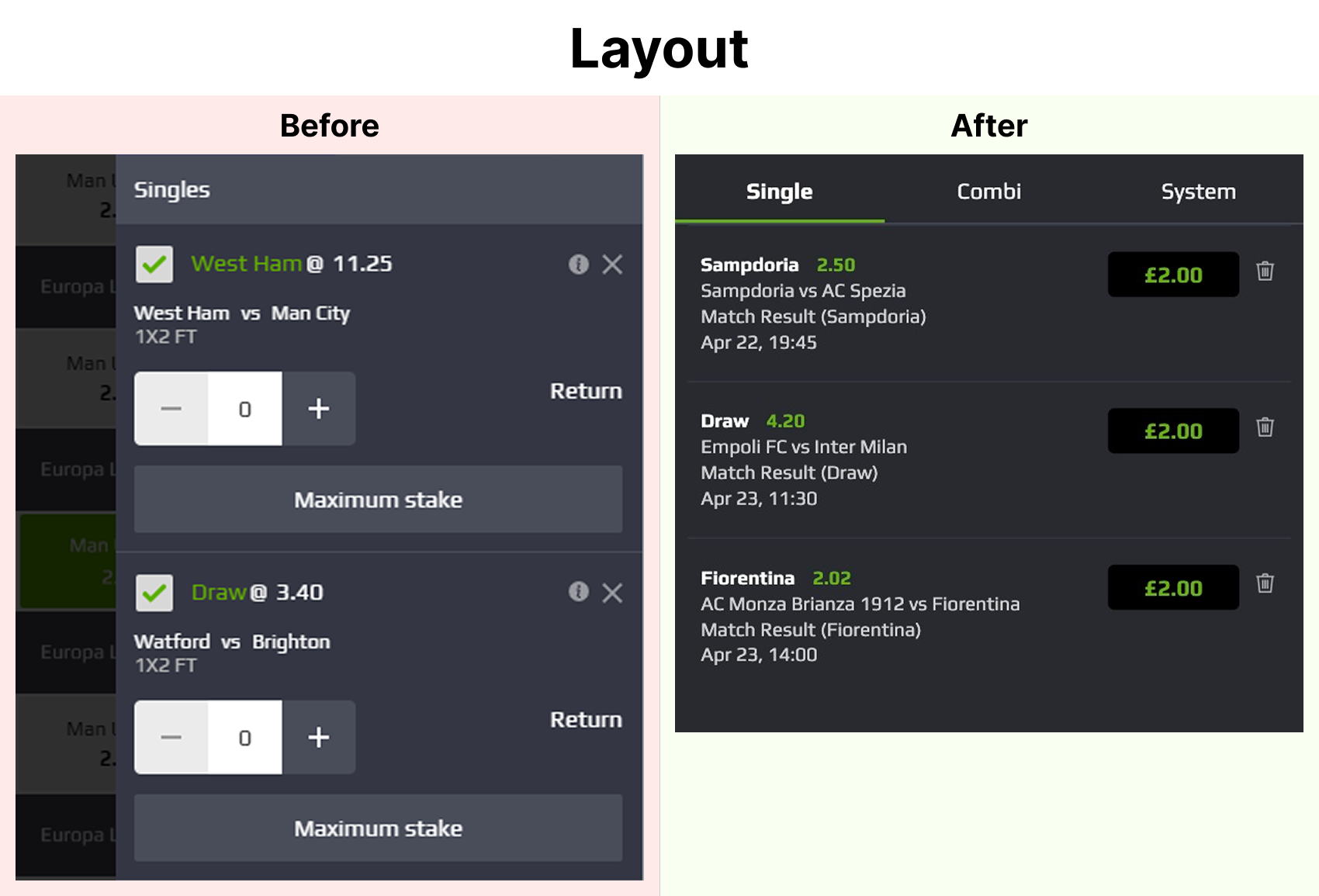
The previous structure collapsed visually when more bets were added. Spacing was inconsistent and elements shifted unpredictably. I created a consistent block pattern so single and multiple bets stay aligned and easy to read.
5. A clearer final summary and call-to-action
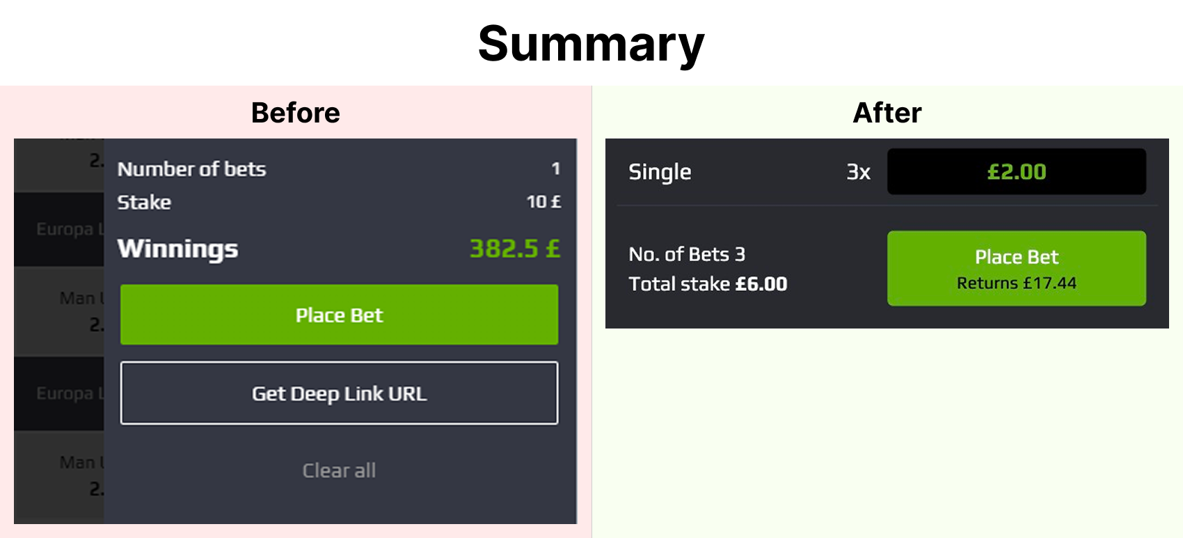
Totals, stake and the call-to-action lacked hierarchy and felt disconnected. Users had to work harder to confirm their bet. I grouped totals together, lifted the CTA visually and clarified the return value so the final step feels more confident and predictable.
Design system integration
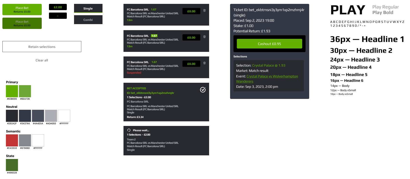
I documented spacing, states, typography and interactions so developers could build the component accurately. This keeps the experience consistent across screens and makes the betslip easier to maintain and extend.
The final designs
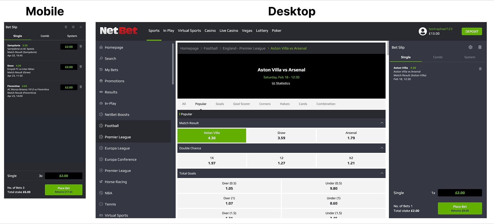
The new UI is clean, simple and direct. It helps users place bets faster and with more confidence.
Result
- Clearer structure.
- Stronger feedback.
- Faster stake input.
- Less hesitation before placing a bet.
The betslip is now easier to understand, faster to use and more reliable during real betting behaviour.
Summary
I transformed a cluttered, outdated betslip into a clean, simple and predictable component. The redesign improves clarity, speed and overall confidence during bet placement.